

help me with my homework, please!
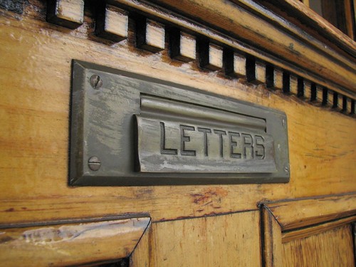
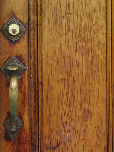
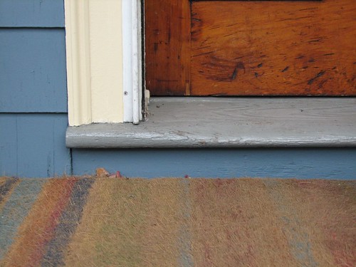
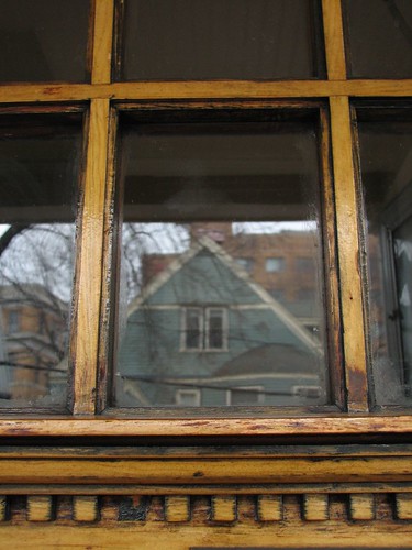
I'm taking a photography class and the first assignment was to take photos of the front door. I'm kind of scared of taking photos along for everyone else to critique, especially since the teacher is kind of abrupt and intimidating. I also just took these photos in a hurry this morning, so I didn't put as much thought into it as I would've liked (I have my thesis committee meeting tomorrow, so this class is not my top priority right now).
So, which 3 photos should I print? These are my favourites, but there are some more variations on the same pictures here. If you have suggestions on what I should do differently, I'd be glad to hear them, too.
(I know this is a little blurry; I might try to retake it)

(I kind of like the underexposed version)

posted by Lucy @ 5:14 PM
11
comments
![]()


11 Comments:
I really like the one with the rug and the bottom one, with the focus on the reflection. I'm no photographer myself, though.
I like these:
1, 2, 3
For the window, I like the exposure on this one but prefer the framing on this one.
I like the second and third. I like the texture of both of those. The rug is really cool, and the roughness of the wood on the second one is cool. Your front door is pretty. Mine is plain.
I like the first one and the 5th one.
I like all of them - but for some reason, the one with the word three in it calls to me.
p.s. if you want a talented photographer to give input, see if you can get ianqui lured over here.
http://ianqui.blogspot.com/
Thanks for your feedback!
From away, I might try to retake the window one to combine the better exposure and framing.
I really like the word three, too, but I thought the doorbells made it look kind of messy and crowded.
Shrinky, I also posted this to my photo blog, in the hopes that some of the more talented photographers who read that will comment.
I like the first one and the third one best. For the windows, the bottom one is the one I like most.
I like the first one with the mail slot a lot.
I really like the one with the letter slot and the one with the rug, too.
But maybe you should just take a shot of the sign over the door that says "Sanders."
:)
I really like #1 & #3--the sense of composition is very nice, IMO. Also they remind me of some work a photographer friend of mine did recently, so well done.
Post a Comment
<< Home